1679467
Frage 1
Frage
A yellow foreground (text) on a red background separates the areas and provides a contrast in brightness, making a sign more legible. This color combination is always accessible.
Antworten
- True
- False
Frage 2
Frage
"Hue" is the lightness or darkness of a color.
Antworten
- True
- False
Frage 3
Antworten
- True
- False
Frage 4
Frage
Usually, if something is legible in grayscale, then a color-blind person can view the information.
Antworten
- True
- False
Frage 5
Frage
Everyone loves Christmas! Use Christmas colors, red and green, whenever possible.
Image:
Red_on_Green.PNG (image/PNG)
Antworten
- True
- False
Frage 6
Antworten
- True
- False
Frage 7
Antworten
- True
- False
Frage 8
Frage
This statement is correct: Place an "X" inside of the yellow box.
Antworten
- True
- False
Frage 9
Frage
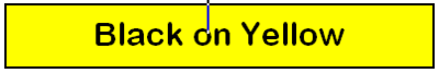
Black and yellow is another combination which usually has a high contrast. Use this combination frequently.
Antworten
- True
- False
Frage 10
Frage
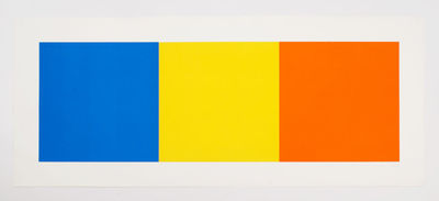
Orange should be used ONLY with large text and as a highlight.
Antworten
- True
- False
Frage 11
Frage
Bright colors such as magenta text on a blue background help people with color vision to read.
Antworten
- True
- False
Frage 12
Frage
Because orange is neither very dark nor very light, it is easy on the eyes and transfers to grayscale well.
Antworten
- True
- False
Frage 13
Antworten
- True
- False
Frage 14
Frage
When we talk about contrast ratio we are referring to the difference in value.
Antworten
- True
- False
Frage 15
Frage
Reduce the afterimage effect from brightly colored hues, such as bright blue on pale pink, by making one of the colors a pastel or dark shade.
Antworten
- True
- False
Möchten Sie mit GoConqr kostenlos Ihre eigenen Quiz erstellen? eigenen Mehr erfahren.