As you may know we recently updated our Resources landing pages. Following on from this we have made significant changes in the appearance of the overview pages of our Courses as well.
Here is how all GoConqr Course overview pages will look like from now on.
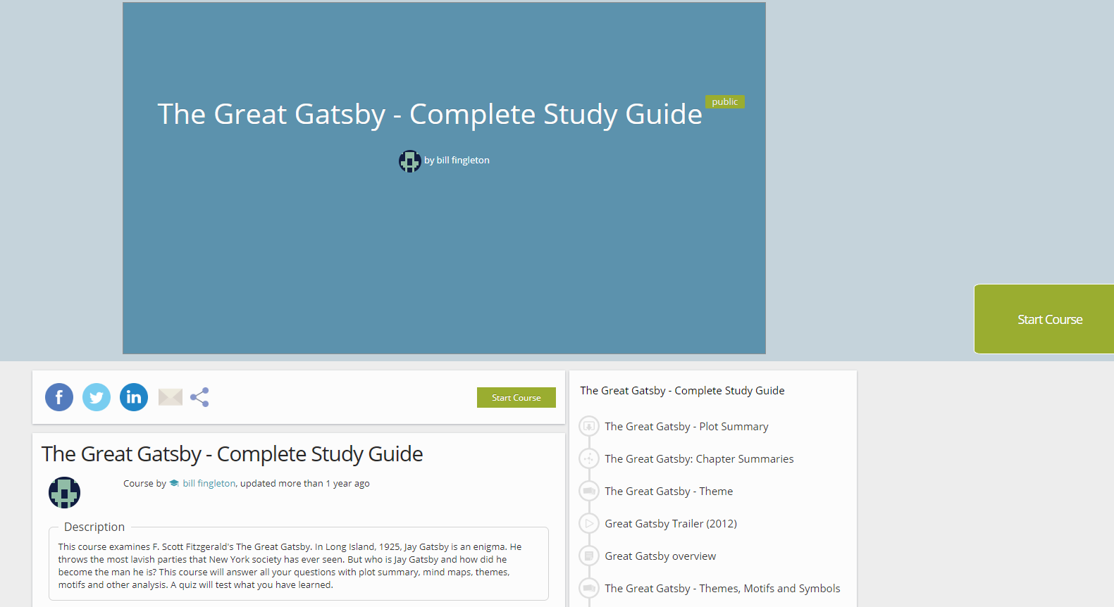
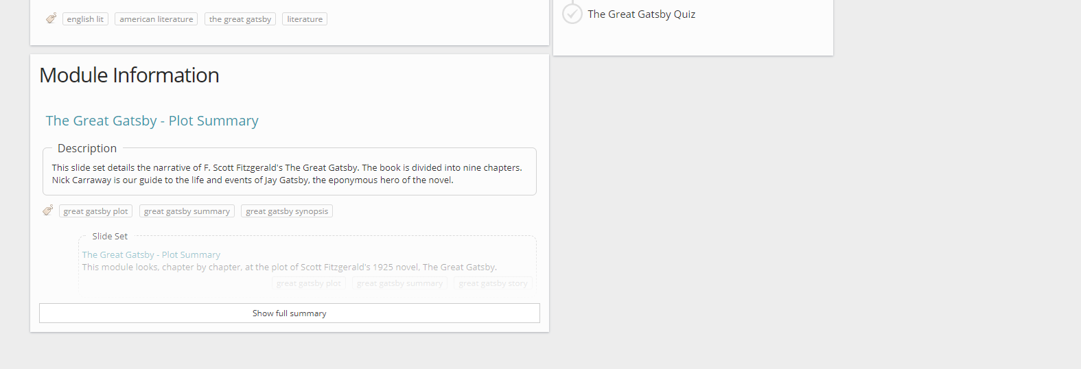
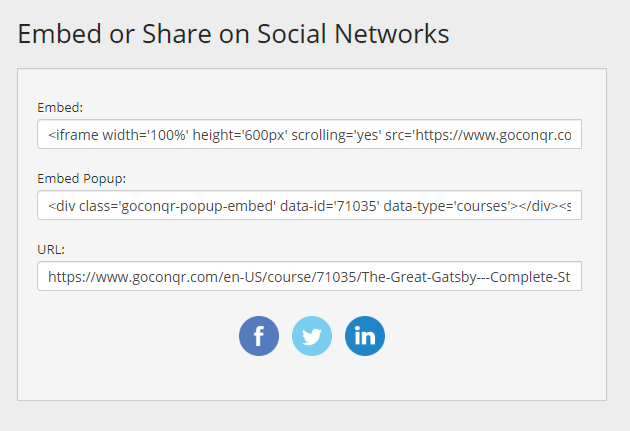
This new format will allow you to share your courses much quicker: whether you choose to do so via email, Facebook, Twitter or LinkedIn. All you need do is select the corresponding button. You can also get the links to share them on your personal website or blog by clicking the share button.

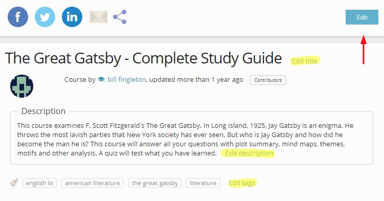
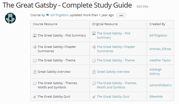
Under the share options you will find a section with essential information about the course: title, author, date of last update, contributors, description and tags. If you are the author of the course, you can edit these fields directly in this section. You can even edit the whole course from here. The more information you provide about the course, the easier it is for you to manage your resources and the more relevant courses we can recommend to you.
The ‘contributors’ tab allows you to see who the authors of the content in each of the modules of a course are. This way everybody gets recognition for their work, whether it’s a group of students creating a course in collaboration or a teacher creating content for their classes.

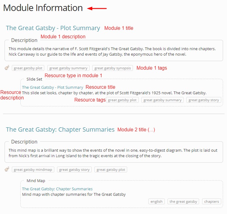
You will also see a new section called ´module information´. Here you will find a summary or overview of all the modules within the course. You will also be able to see the descriptions of each module and their tags. What’s more, in this section you will also find information on the resource types embedded in each module, their titles, descriptions and tags. This way you can quickly identify the content of a course and easily decide if it’s what you’re looking for.
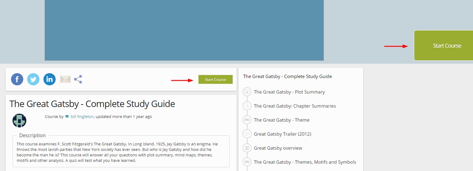
To start viewing a course and its modules, select either of the two green buttons labelled ´Start Course´. They are located at the centre and right-hand side of the page.
You can interact with the different course modules through the “previous” and “next up” buttons as you move along the carousel, or else by clicking on each of the modules on the course timeline.
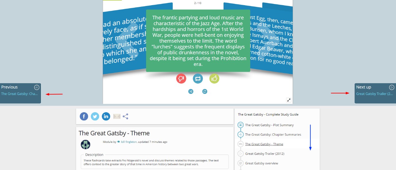
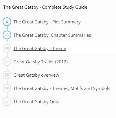
Each completed module will turn blue. Those modules you skip or that you haven’t viewed yet will stay grey. The module you are currently on will be underlined.
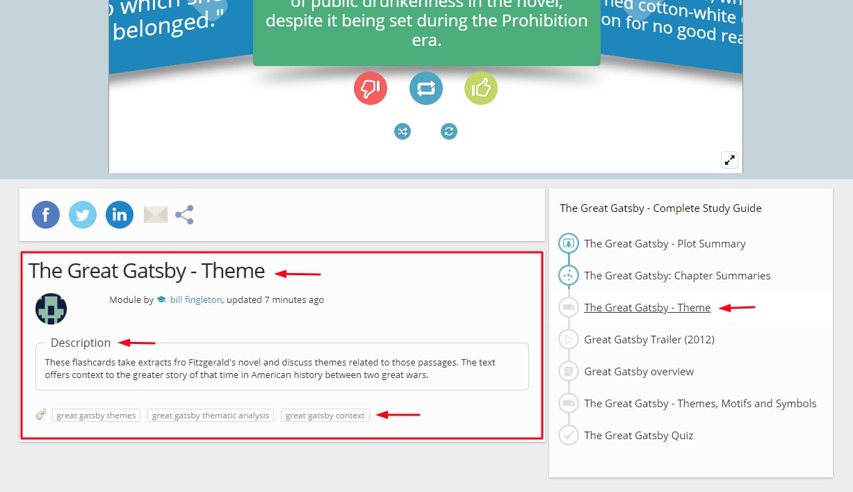
When you click into each course module you will see a section with information on the left-hand side of the screen, right under the share options. This section contains the module title, its description and its tags.
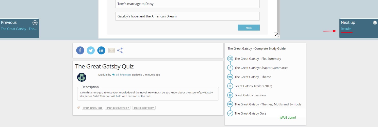
Once you’ve completed all course modules and these have all turned blue on the timeline, you can see the results you obtained in the course. To do so, click on the right-hand side button of the carousel, labelled with ´Results´. Remember that the results button will only be shown if you’ve completed the entire course. If there are modules that still appear grey in the timeline, it means they aren’t completed, and you won’t get your results!
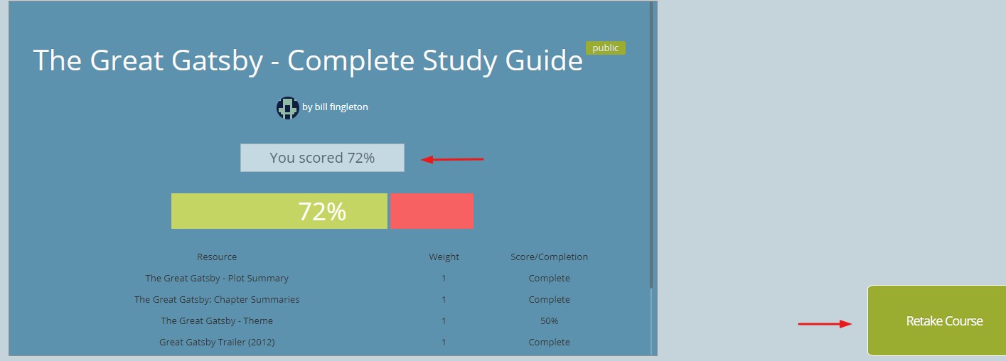
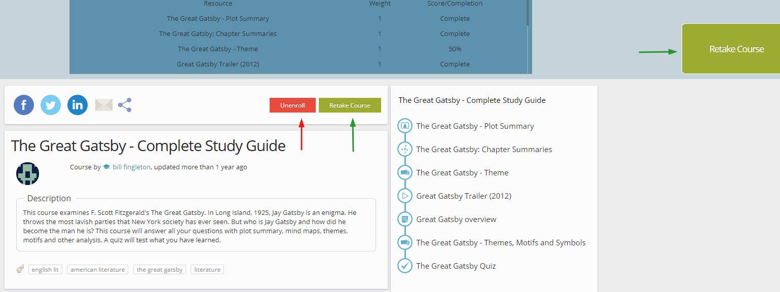
Once you’ve finished the course and have looked at your results, you can click on ´Retake Course´ button visible on the right-hand side if you wish to take the course again.
Finally, if you start viewing a course and decide to leave, whenever you’re back you will be able to retake the course wherever you left off.
If you are not the author of the course, whenever you visit the main overview page of the course you will see an option to unenroll. Once you unenroll from a course, it will disappear from the “enrolled courses” list on your profile.
And that’s all folks!
We hope you like the new design of our courses tool and we sure hope you find it useful too!
Stay tuned to our blog and social media accounts to see what other improvements we will be bringing this year.
If you like the recent changes let us know on social media, leave a comment below or else contact us at feedback@goconqr.com. We will be happy to hear your thoughts!
