Here at GoConqr we are constantly focused on improving our tools to help users with their learning. We’ve simplified and improved our resources layout so you can find what you need when you need it. Here we will explain the changes we have made to resources and what the new features are.
First up, the following is an example of how all GoConqr resource landing pages look like.
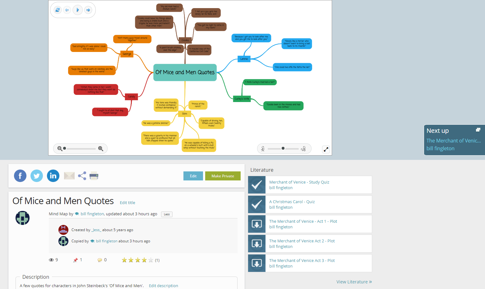
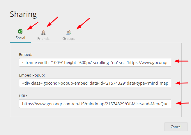
Using the action toolbar outlined below you can share your resource on your social media channel of choice or email it to a colleague or friend by clicking on the corresponding email icon. If you want to embed the resource on your own website or blog, you can obtain the embed links by clicking the share button next to the email icon. We provide the specific code for the type of embed you want to use, whether you want to use an iframe, a module popup or a basic URL hyperlink. This button will also provide you with options to share your resource with friends or groups on GoConqr. And of course you can use this action toolbar to print the resource.

If you are the author of the resource, you can edit it directly from the resource landing page.
For premium users, you will have the additional option of making your resources private! If you would like to avail of this feature become a premium GoConqr user here.

The next section breaks down the essential elements of a resource. This includes the title, name of the author, date of publication, description and tags. If you are the author of the resource, you will be able to edit these fields directly on this page. Cool, isn’t it?
Don’t forget to add accurate information to a resource’s tags, title and description, this will make it easier for you to find later, and it also allows us to recommend more relevant resources for you.
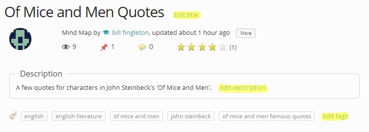
⭐You can pin, rate and leave comments on the resource landing page. ⭐
If the resource you are viewing is a copy of another resource, you will always be able to track it back to the original resource. To find out simply select the option “more” beside the author’s name and last update date. This way everyone gets recognition for their work.


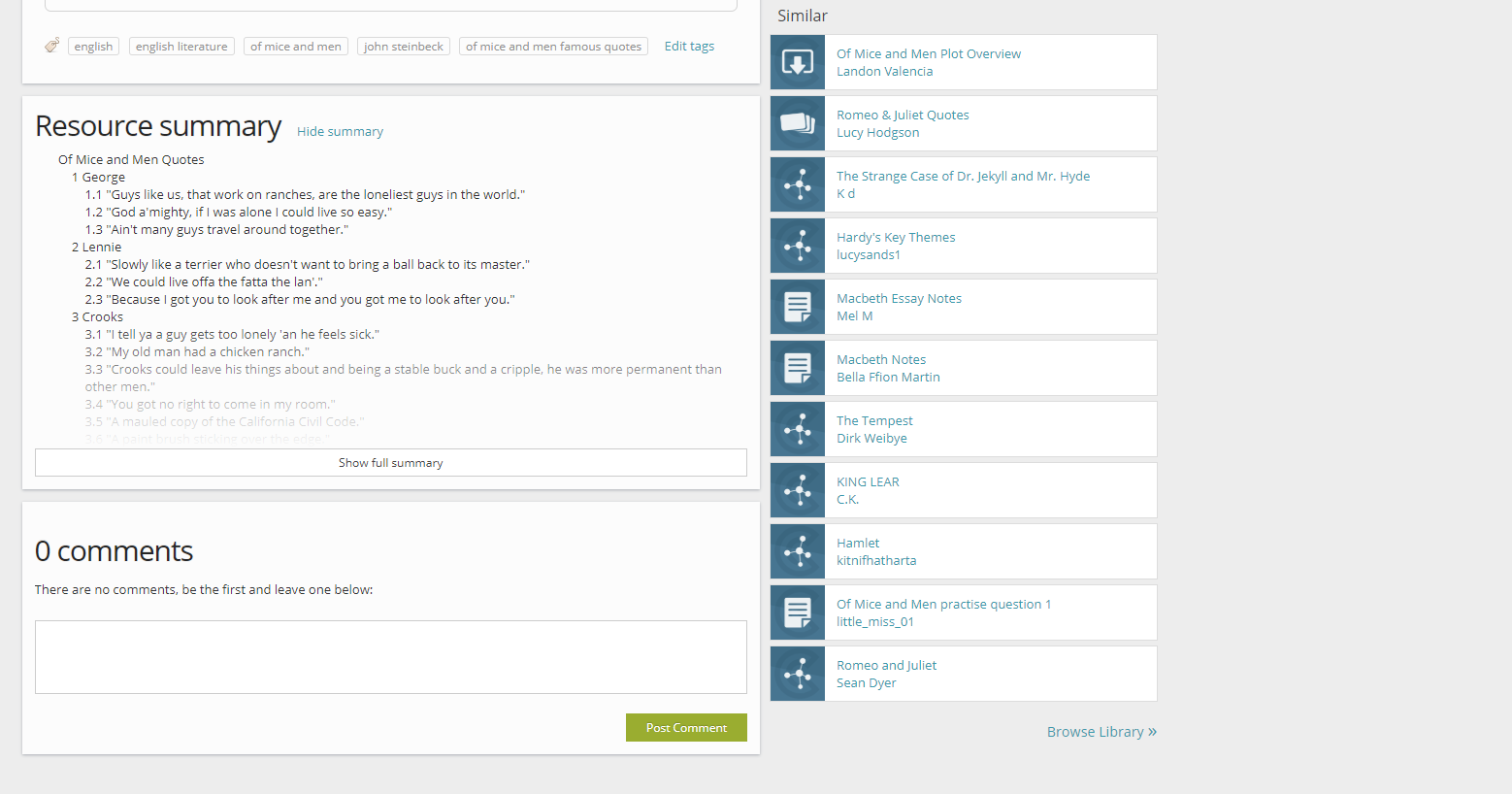
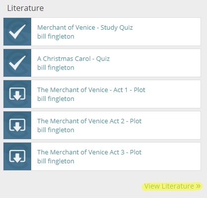
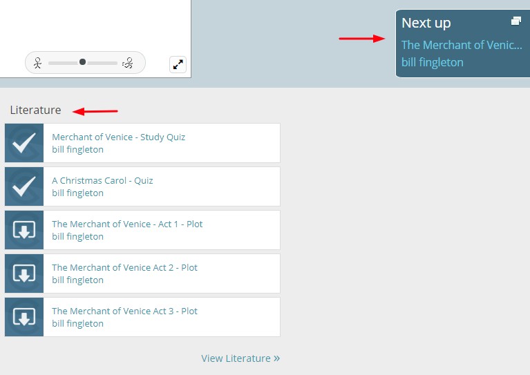
The column on the right-hand side of the screen is divided into two sections: The first section tells you the page you came from before opening the resource. In this example, we have accessed the resource from a folder in our profile called ‘Literature’. So the resources appearing on the list are those you have saved in your ‘Literature’ folder. You can get back to the folder anytime by clicking ‘View Literature’. If you have accessed the resource from a group, you will be presented with other resources shared on that group and a link to go back to that group.
The ‘next up’ button beside the resource image will prompt the next resource in your folder list. In this case the next resource would be ‘Merchant of Venice Quotes with explanations’ from your folder ‘Literature’.
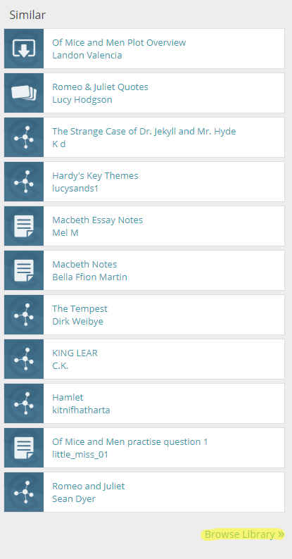
The second section is called ‘Similar’. In the Similar section you will find suggested resources from our library related to the topic you are currently looking at. If this list doesn’t quite have what you’re looking for, simply click the ‘Browse Library’ button at the bottom of the section and you can view all the relevant resources on our library.
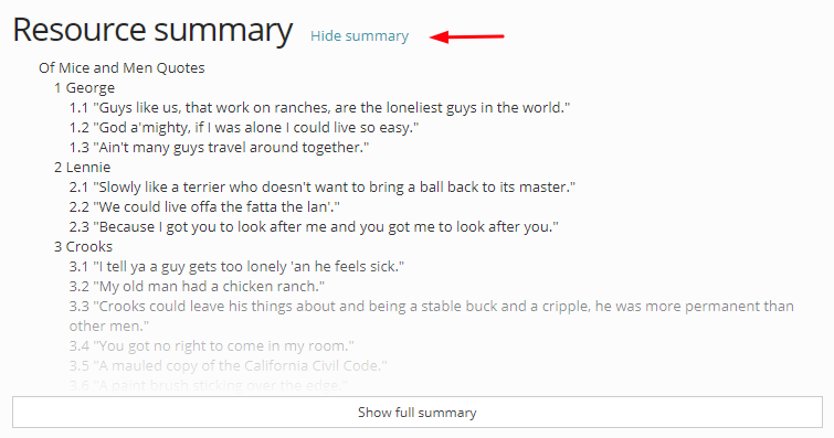
Finally, there is the resource summary section. This section presents a summary of the text on the resource. If you have a Premium plan (hyperlink), you can choose to hide this section so that it is not visible to any other users.
And that’s it for now folks!
To find out what other improvements and new features we will be implementing this year, keep an eye on our blog posts, social media and announcements.
If you like these new changes tell us on social media or leave a comment below, and if you have other suggestions or feedback you can always email us at feedback@goconqr.com.
Happy learning! 🎓
